
Product Design: Cinema App & Website (Case Study)
A case study of a complete product design project including app & responsive website for cinema
Project overview
The product:
I created a ticketing app & responsive website for the local cinema. The goal of the app was to allow users easily order cinema tickets for both native and non-native people.
Project duration:
August 2023 - February 2024
My role:
Product lead, UX researcher, UX designer
My responsibilities:
User research, information architecture, wireframing, visual design, prototyping
Tool:
Figma
Step 1: User research and product ideation
I conducted research, interviews and created user groups and personas to understand the users I’m designing for and their needs. A primary user group identified through research was single students of age 19-26, including non-native language speakers.
This user group confirmed initial assumptions regarding most socially active group of users, but also revealed their needs and pain points. Some of the users are non-native to local language, and this excludes them from using different services. Other user needs included saving time, selecting seat location and inviting friends with the app.
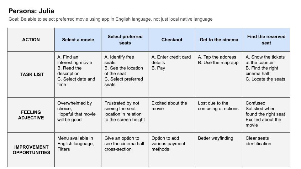
Persona: Julia
Julia is a single full-time student who needs a way to order cinema tickets in English language because she doesn’t speak or read local native language necessary to buy tickets normally.

User journey map
Mapping Julia’s user journey revealed how helpful it would be to have a menu with the option to select English language on top of local native language.
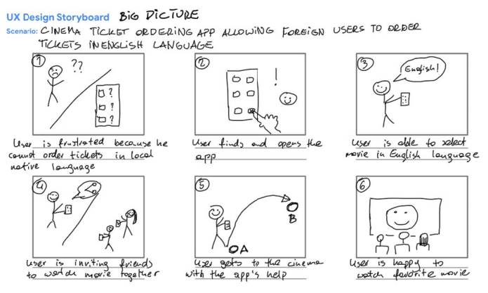
Storyboards
Creating user storyboards helped me to visualize user experiences in more detail in order to find out, what type of product the user needs.

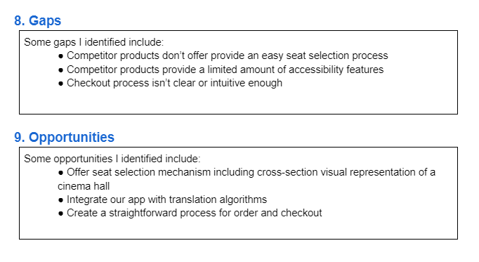
Competitive audit
After roughly sketching the product and its features I conducted a competitive audit of similar products. That knowledge helped me to create a product that’s helpful and unique for users, by identifying similar products' gaps and opportunities.
Step 2: Wireframes and low-fidelity prototypes
After identifying some of the key screens, actions, and decisions in the product’s user flow, I started the design process by creating wireframes.
"Paper" wireframes
The goal was to create simple wireframes of an app’s home page, showing the basic functionality. I created five different versions and a final, refined one including best design features from all versions. Thanks to this, I was able to make better decisions during the following design stages.

Digital wireframes
After creating simple wireframes I started designing digital wireframes in Figma. The homepage was designed to be as simple, but as functional as possible, based on findings from user research.

The app was intended to allow users book tickets with less steps, making their life easier and maximizing cinema’s profit at the same time.

Low-fidelity prototype
The low-fidelity prototype in Figma connected the primary user flow of buying a cinema ticket including changing the language so that the prototype can be used in a usability study with users.

Step 3: Testing prototypes and reiteration
I conducted a usability study research that gave me valuable information about the design. Afterwards I was able to synthesize the study results and translated them into actionable prioritized insights in order to implement them in the high-fidelity design phase.

Step 4: Creating high-fidelity mockups and prototypes
After low-fidelity designs have been refined and retested, I started to build high-fidelity mockups and assembled them into a working high-fidelity prototype for further testing and refinement.
Design system
One of the first decisions was to create a unified design system, including typography, color themes, buttons and icons. For this project I created my own design system. At this stage I created some of these elements as usable components.

Mockups
The goal was to implement the insights from usability study and make the app easy to use and good-looking.


High-fidelity prototype
After mockups were built and refined, I connected them into a working prototype. I made sure to arrange mockups in the navigational order that supports the user journey I mapped out earlier in the design process.

Click to view the prototype in Figma
Step 5: Further testing and takeaways
User testing shared the design was intuitive and easy to use. They appreciated the option to change the language.
What I learned:
In this project I learned the value of accessibility. I learned that even small things can add to the usability and fulfill user needs.
Step 6: Creating a responsive website
The next step of this project was to create a responsive website for desktop and mobile devices.
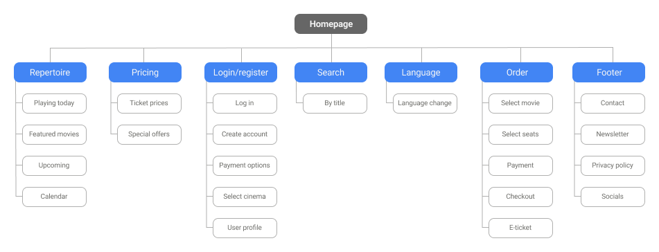
Information architecture and sitemap
In order to organize the content in a logical and easy to use way, first I created a sitemap. The goal was to arrange strategic information architecture that would further improve the website navigation.
Wireframes and low-fidelity prototypes
After creating the main information architecture for the product’s user flow, I started the design process by creating wireframes.
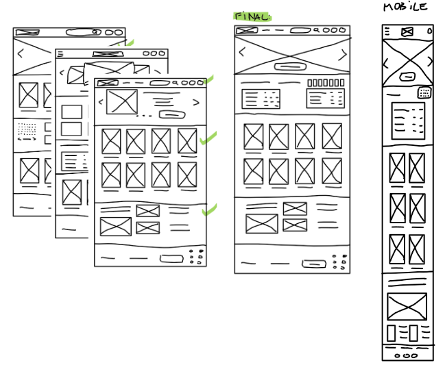
"Paper" wireframes
The goal was to create simple wireframes of the website's home page, showing the basic functionality. I created three different versions of a desktop page and a final, refined one including best design features from all versions. Thanks to this, I was able to make better decisions during the following design stages.
Digital wireframes
After creating simple wireframes I started designing digital wireframes in Figma. The homepage was designed to be as simple, but as functional as possible, based on findings from user research.

Creating high-fidelity mockups and prototypes
After low-fidelity designs have been refined and tested, I created high-fidelity mockups and assembled them into a working high-fidelity prototype for further testing and refinement.
Design system
In order to maintain consistency I decided to use the design system from the app, however some of the elements needed some adjustments. I also created elements as usable components to save time. Some of these components had to be adjusted for mobile version.

Mockups
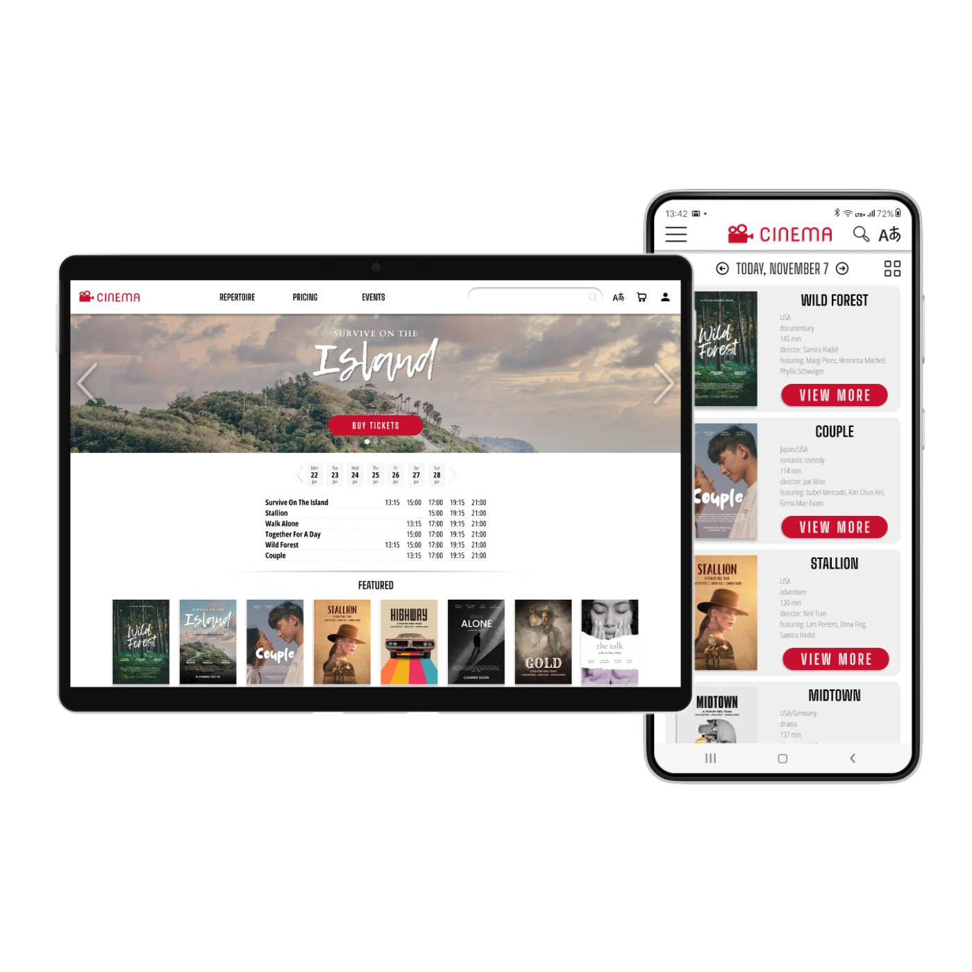
The website was to be easy to navigate and good-looking at the same time. I decided to use a large hero image to feature most popular movies with the option to quickly buy tickets.
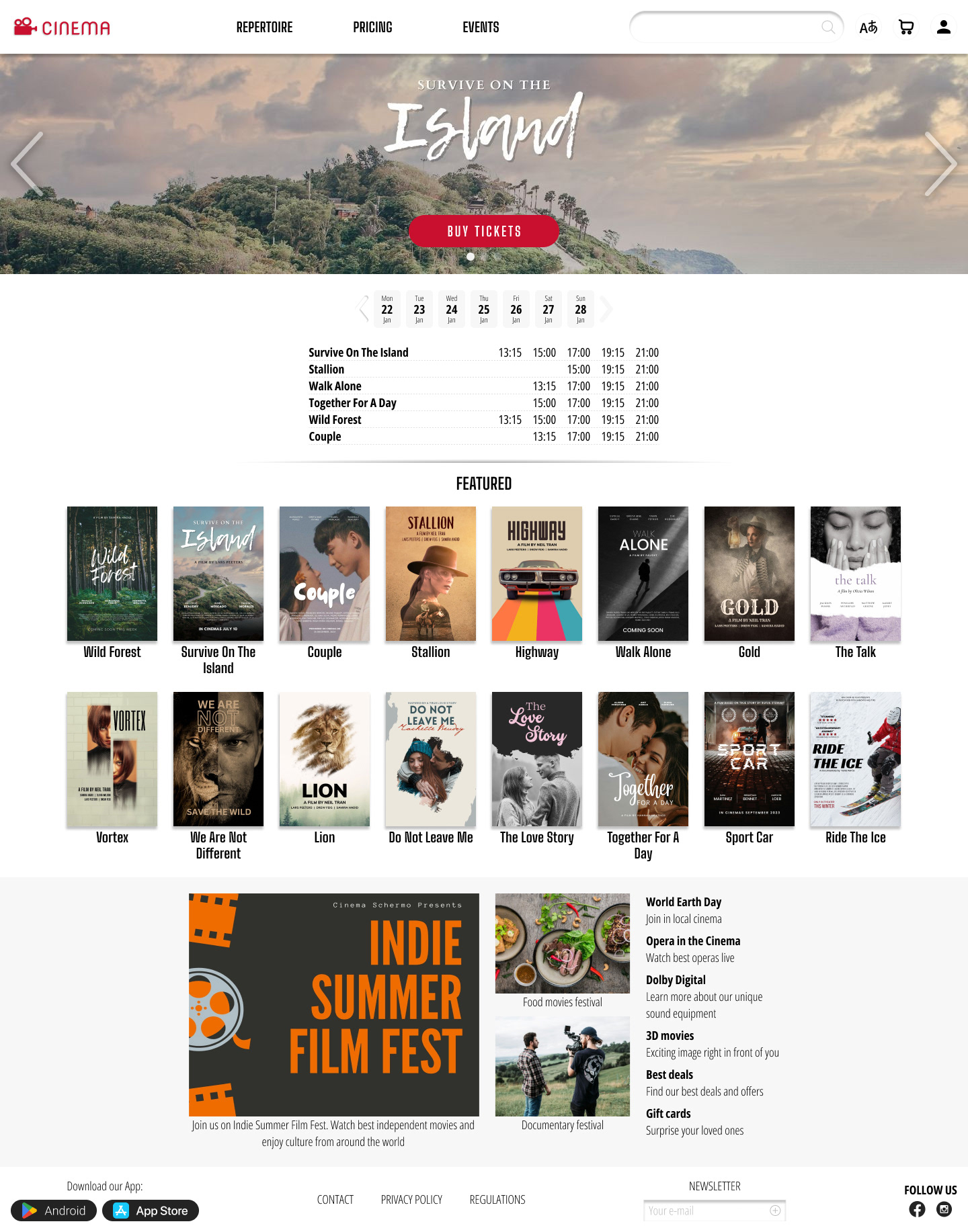
With the help of the grid, I made sure to use consistent spacing between elements of 8px, 16px, 24px and 32px or multiplier of 8px. Moreover, I grouped the elements into auto layouts in order to make them behave properly.

Some of the features I included in the design were cards with featured movies. In the mobile version these cards were made with option to scroll horizontally, to save some space.

High-fidelity prototype
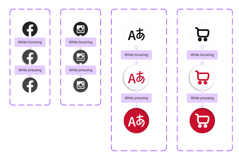
After mockups were built and refined, I made the elements interactive by adding different state variants and interactions.
Click to view the prototype in Figma:
Desktop website
Mobile website
