
Web App: Rentify (Case Study)
A design of a user-friendly and intuitive interface that allows users to browse property rental offers
Project overview
A design I made for a recruitment task. It is a user-friendly and intuitive interface that allows users to browse property rental offers. This whole task took me about one day to make.
Tools:
Figma, Adobe Photoshop, ChatGPT
Click to view the design in Figma
My design process
Empathizing with users
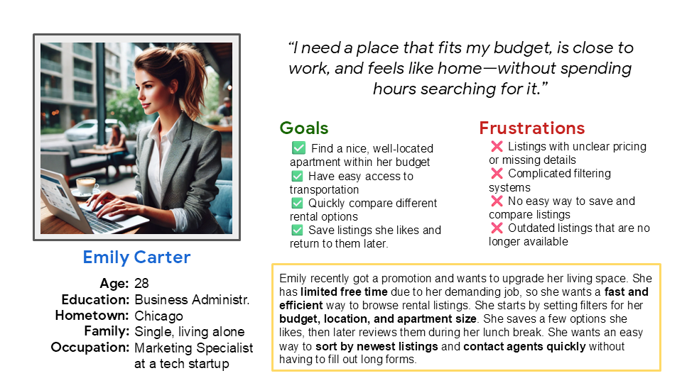
In order to start the design process I first created a user persona to help me better understand the typical user.
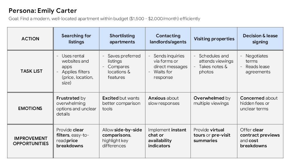
I then created a user journey map that showed me the key pain points and areas for improvement that I should address in my design.
Defining user needs
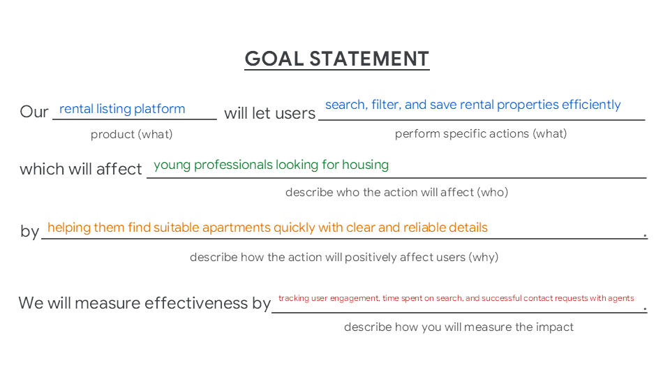
In next step I summarized the findings into a goal statement to articulate a specific and measurable goal for the product I’m designing. I now clearly know what to do.
Ideating design solutions
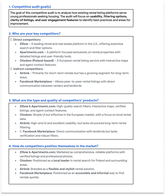
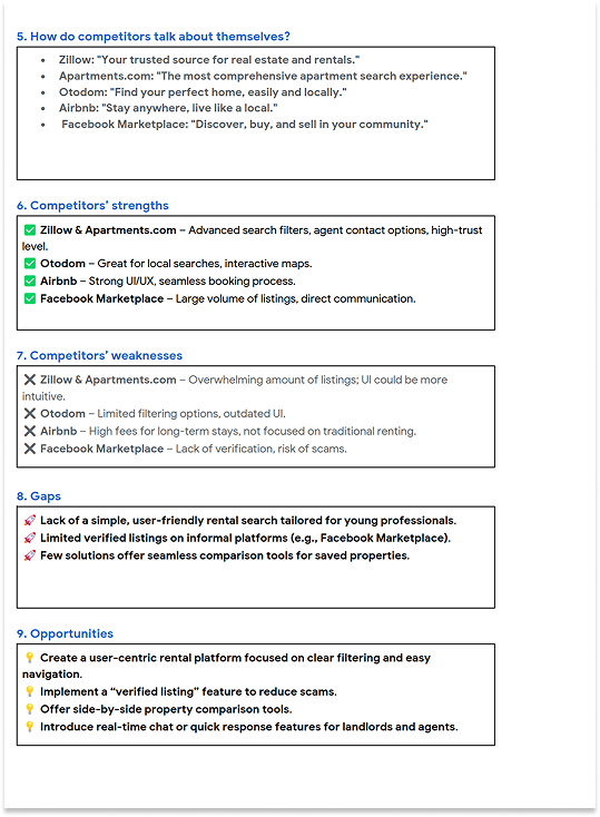
Next I had to analyze how existing rental listing platforms serve young professionals seeking housing. The audit helped me to identify best practices and areas for improvement.
Creating lo-fi prototypes
Before starting to design I created a user flow that helped me you visually map the steps that user will take to interact with my product, complete key tasks, and achieve their goals.
User Flow for Emily Carter - Rental Listing Platform
User Task: Find and inquire about a rental apartment.
User Flow Steps:
1. Home Screen → User lands on the platform.
2. Apply Filters & Search → User selects budget, location, size, and applies filters.
3. View Listings → User sees a list of filtered rental properties.
4. Select a Listing → User clicks on a property for details.
5. Decision → User decides whether they like the listing: Yes → Proceed to inquiry. No → Go back to the listing page and select another property.
6. Contact Landlord/Agent → User fills out the contact form or calls the agent.
7. Confirmation → User receives a message confirming the inquiry.
Backward Movement:
If the user is unsatisfied with results, they may return to search and adjust filters.
If the landlord/agent does not respond, the user may contact another listing.
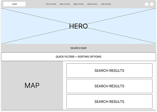
Finally I was able to start the design process. First, I created rough wireframe. In this step I did not put too much work into creating individual components. This rough wireframe was just to give me an idea of where specific sections of the website should be. I wanted to include an additional element: map showing the location of rental apartments.
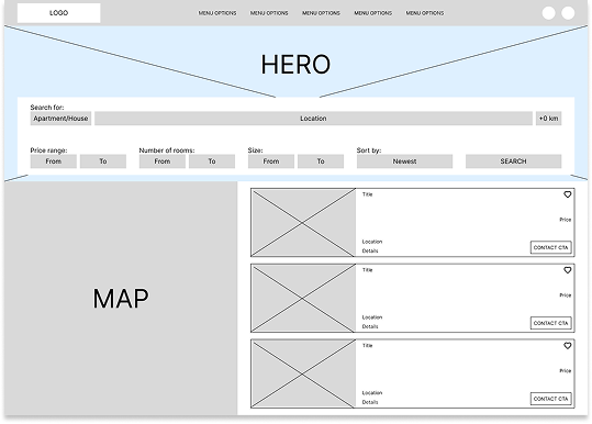
Next I polished this rough wireframe into more detailed one. In this step I made decisions regarding specific spacing between elements (8px, 16px, 32px, 64px), layout of individual sections and I designed the elements more thoroughly in order to maintain the design specifications set in the task.
Creating hi-fi mockup
Finally I started the last step in this task: creating hi-fi mockup. Of course, since this is a training assignment, I made sure to design everything manually by myself, apart from icons I used.
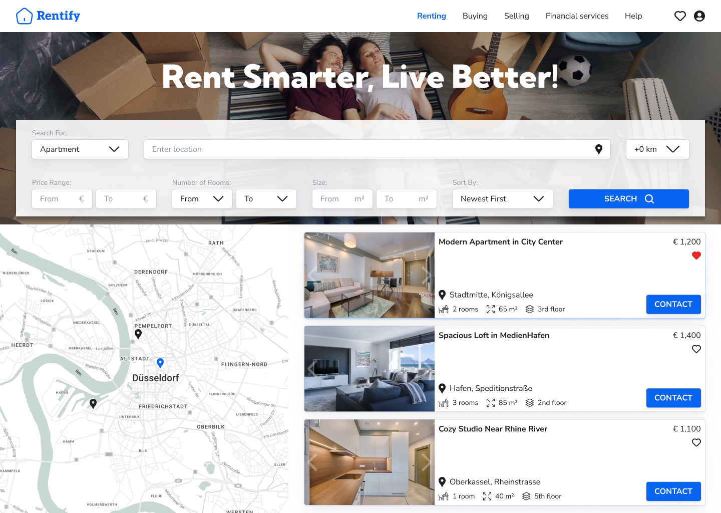
I first decided on the color scheme. I wanted it to be modern, but informative, so I selected classic white + blue theme. I decided to use a modern and readable Nunito Sans font for the main text elements. I then started designing from the top bar. I made sure to include favorite icon where user can see their saved offers. I created a simple logo using a minimalistic icon and text.
Search bar includes all necessary filtering and sorting options, as well as easily visible search button.
Below is the search results section. On the left I implemented a clear map showing search results. On the right the user will be able to see the most important details and add the offer to their favorites or click the CTA button allowing them to contact the real estate agent or a landlord.
